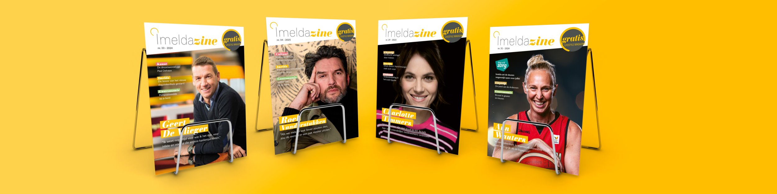
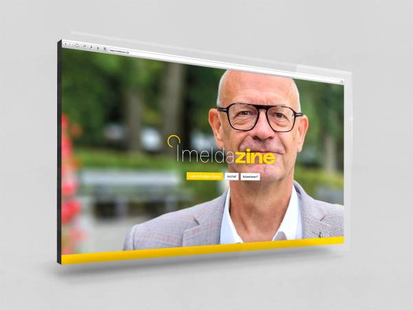
A fresh visual identity for ImeldaZine
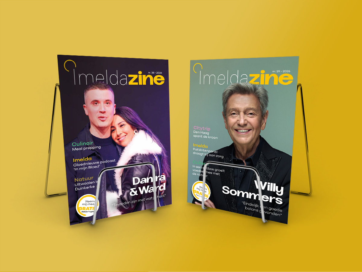
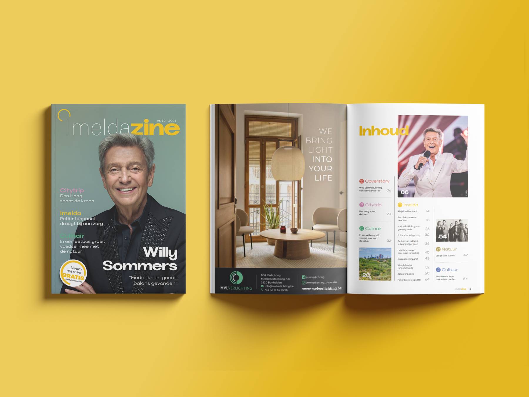
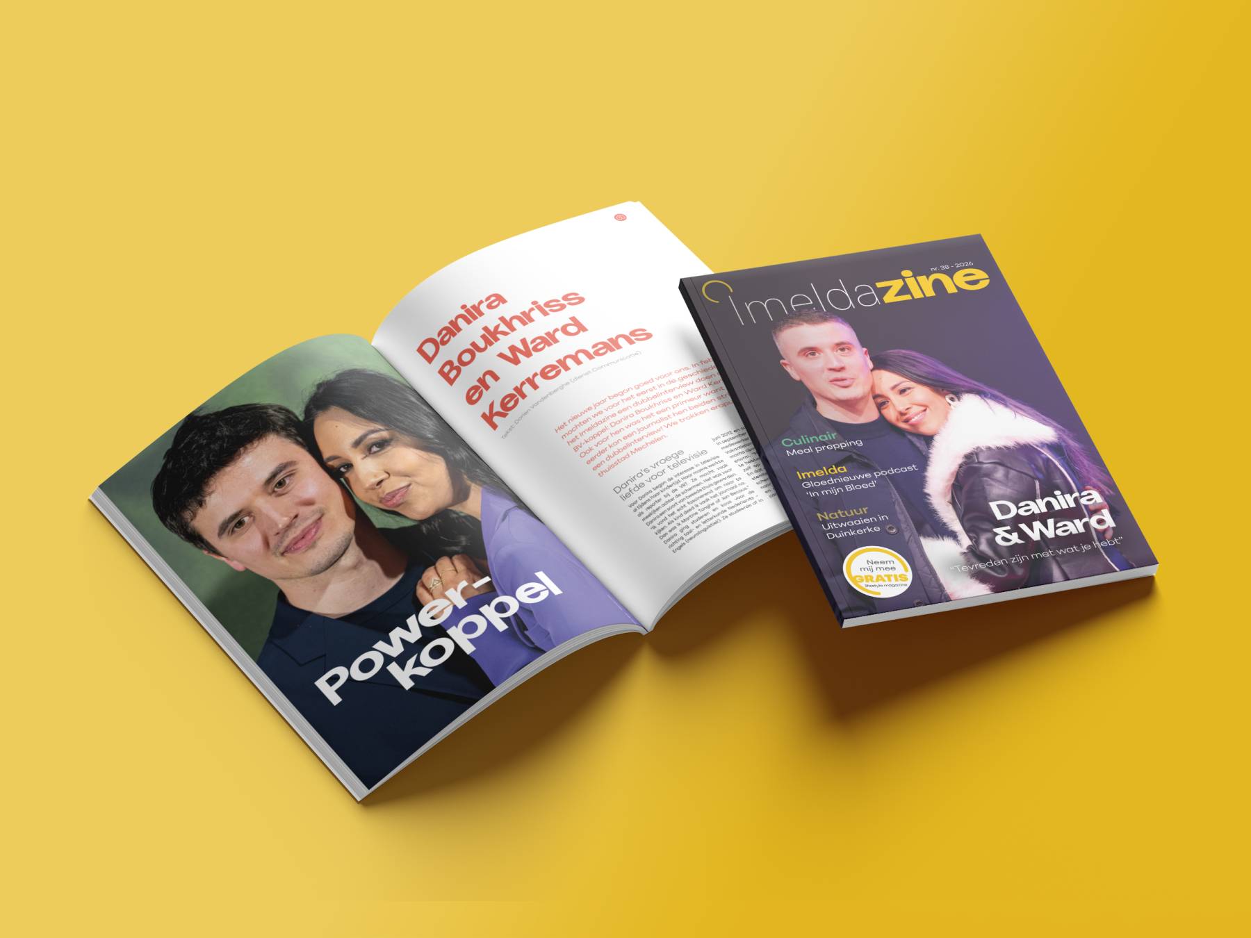
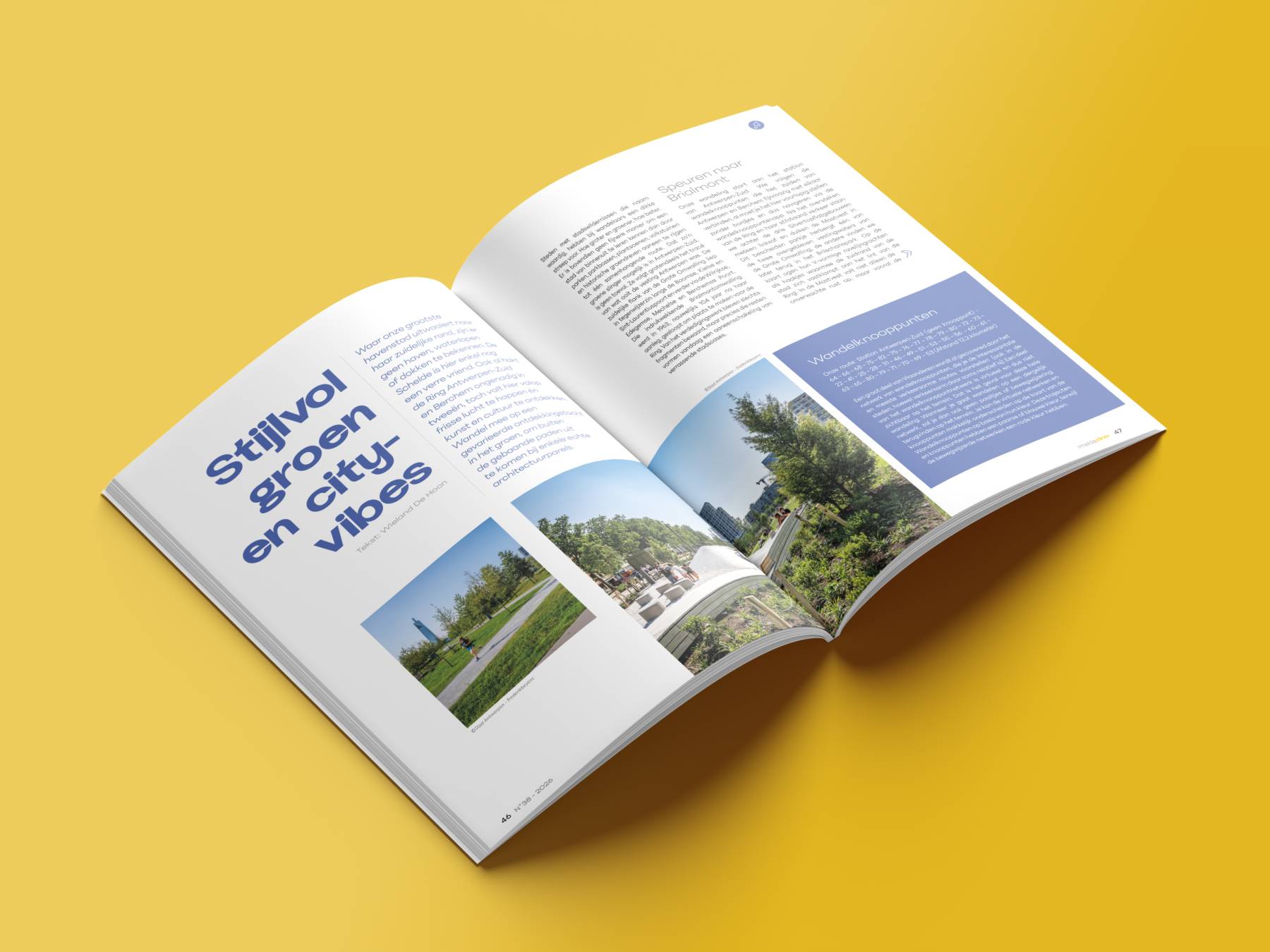
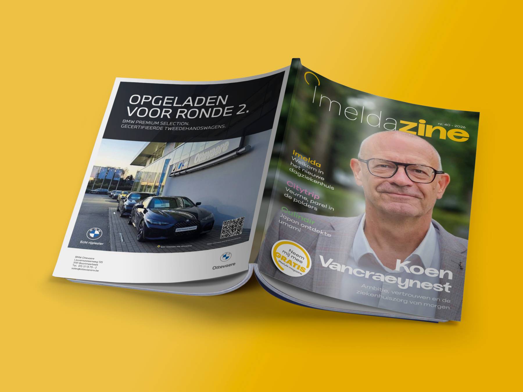
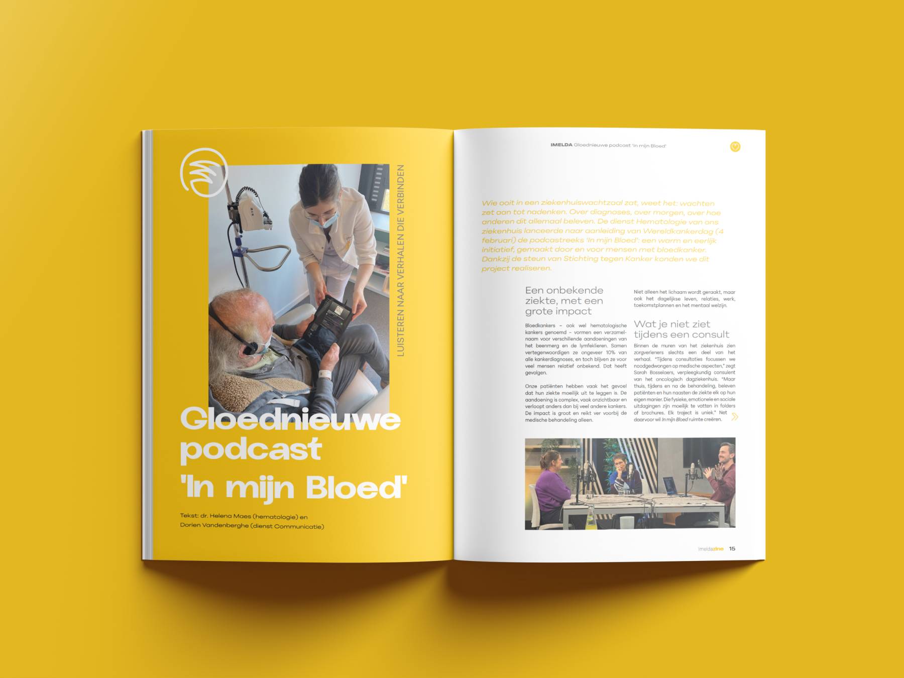
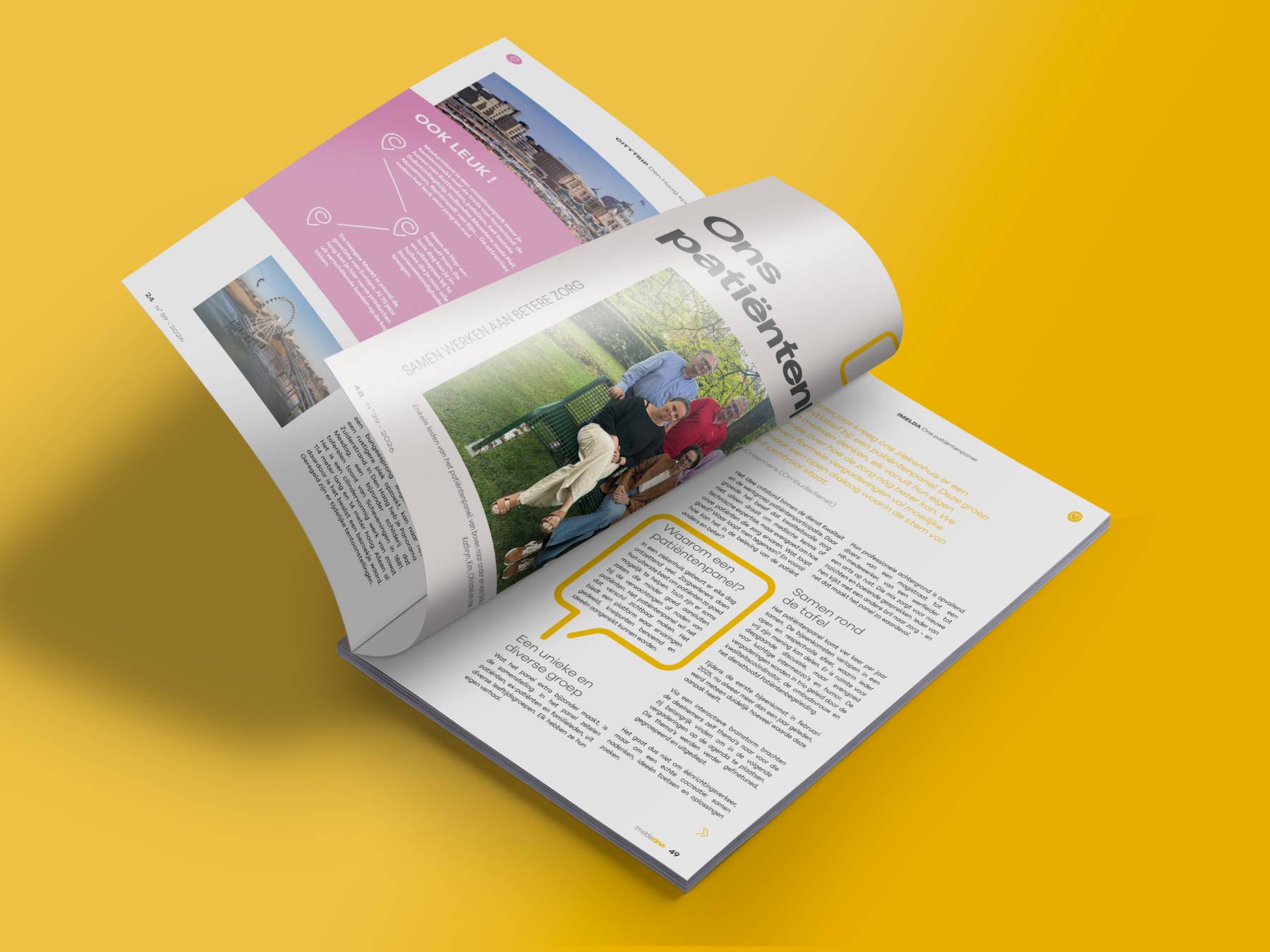
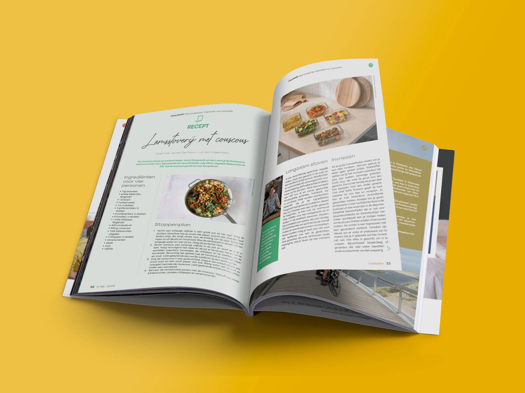
For issue 38, the first edition of 2026, we gave ImeldaZine a completely new look and feel. It was the magazine’s first redesign since its launch in 2015. The brief: make a familiar title feel fresh and contemporary again.
For the new look, we revamped every visible element: the cover, typography, colours and the ImeldaZine logo. The redesign runs throughout the entire magazine. Issue 38 is therefore more than a minor refresh: it establishes a new visual foundation for the publication.
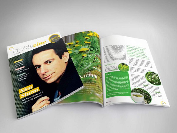
This redesign builds on a partnership that began in 2015. The idea for a dedicated magazine originally came from Crossmark. Today, we take care of the concept, advertising, copy and layout; Imelda contributes to the content and handles distribution.
ImeldaZine is available at the hospital and at Den Olm residential care centre, among other locations. Health and well-being form the common thread, with room for culture, gastronomy and behind-the-scenes stories as well. Issue 38 presents this familiar content in its new style for the first time.
About Imeldaziekenhuis
Imeldaziekenhuis is based in Bonheiden. Through ImeldaZine, the hospital shares information and stories with patients, visitors and anyone else who picks up a copy at the hospital or Den Olm residential care centre.
A case tells the story behind a project: what the brief was, how we approached it and how the different elements came together. Our portfolio offers a broader overview of the work we have created, including projects beyond this selection.
Other projects for Imeldazine
Let's get down to business!
A new idea, extra hands to bring it to life or the right tools to move forward on your own? Tell us what you’re working on. We listen, think along with you and help you take the next step.
Tell us what you need